

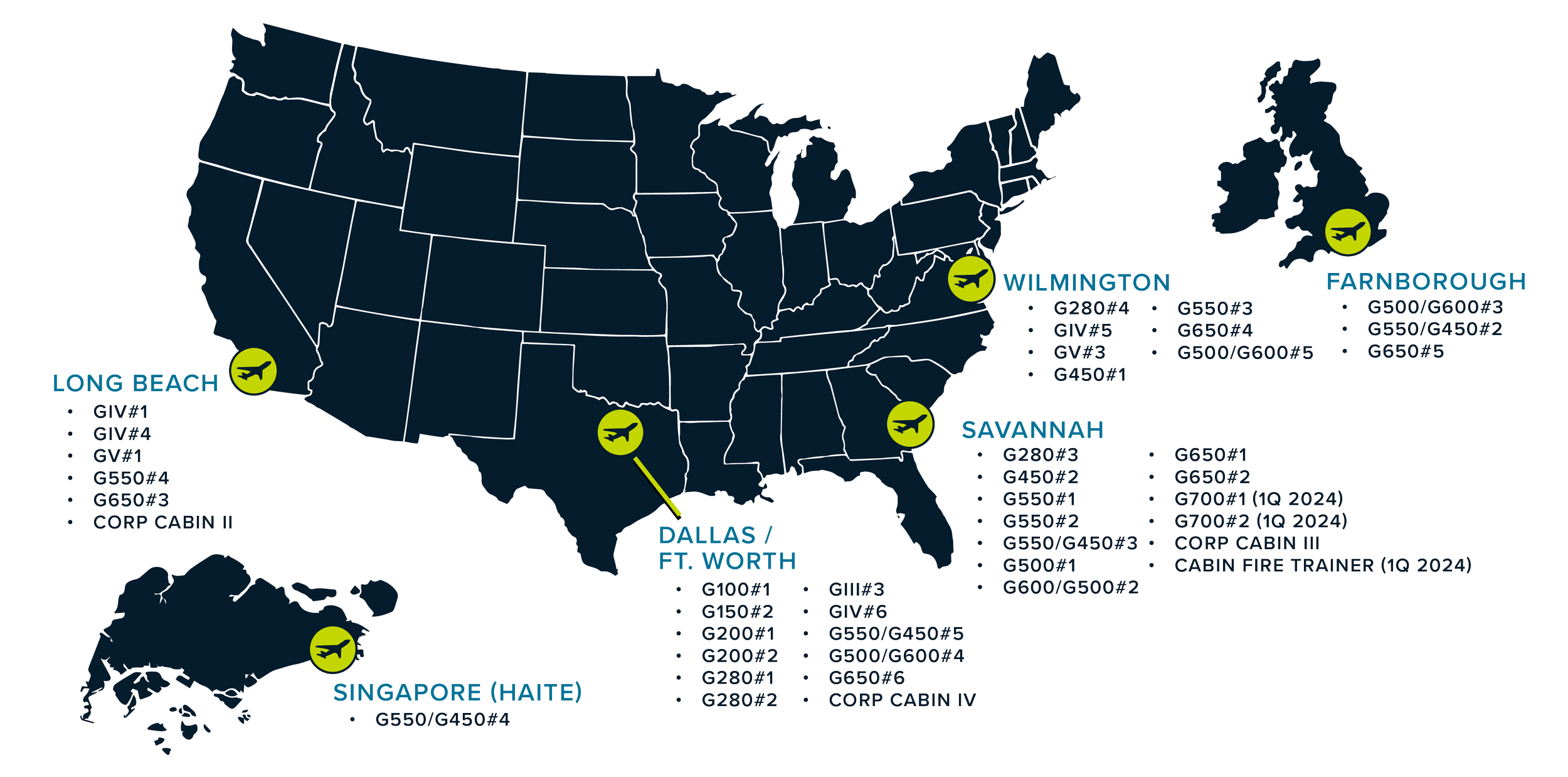
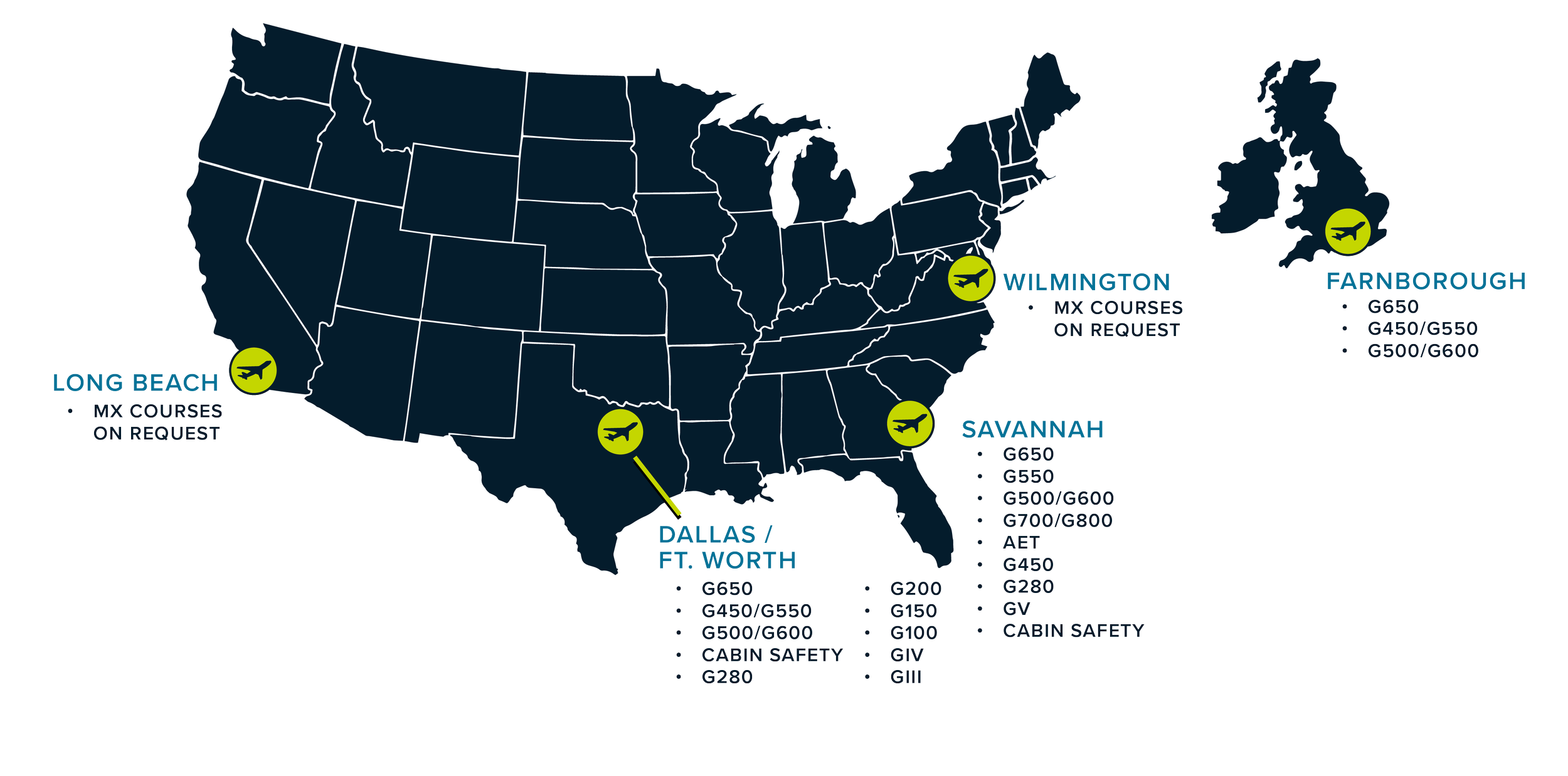
FlightSafety: Training Locations
Redesign of the training facility maps using new branding guidelines.

FlightSafety International - FLEX Thumbnails
-
![Cover of an IMTM maintenance training manual with a clickable play button icon and a hand icon pressing it.]()
IMTM
-
![Cover of the AVIONICS INTERACTIVE IM T M maintenance training manual featuring a silhouette of a fighter jet and a location pin with a star, on a dark background.]()
Avionics IMTM
-
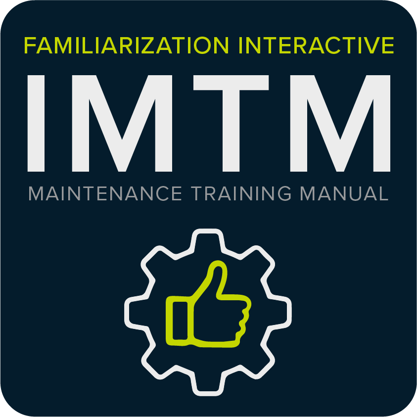
![Cover of an IMTM maintenance training manual featuring a gear with a thumbs-up icon inside.]()
Familiarization IMTM
-
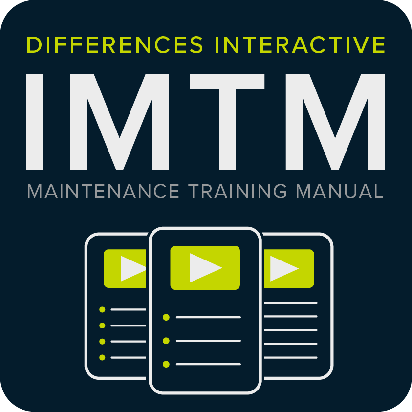
![Cover of an interactive maintenance training manual titled 'Differences Interactive IMTM Maintenance Training Manual,' featuring icon illustrations of three digital documents with play buttons.]()
Differences IMTM
-
![Graphic with the words 'Interactive CPDLC' and icons of a keypad and list, indicating a focus on digital or technical training.]()
CPDLC
-
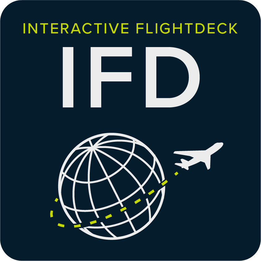
![Design representing an interactive flight deck with a globe and airplane icon.]()
Interactive Flightdeck
-
![Cover of a book or guide titled 'Pictorial Preflight' featuring an airplane with three location markers, each with a star symbol.]()
Pictorial Preflight


FlightSafety: Titan Squadron Logo
An aviation company that wanted a design for their team's squadron. The design had to use their limited branding color scheme while also reflecting the name of the squadron. The logo was used to make stickers, pins, and keychains.

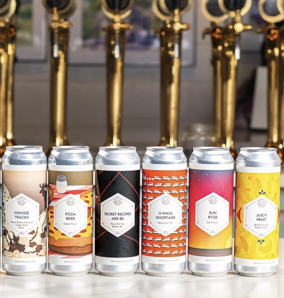
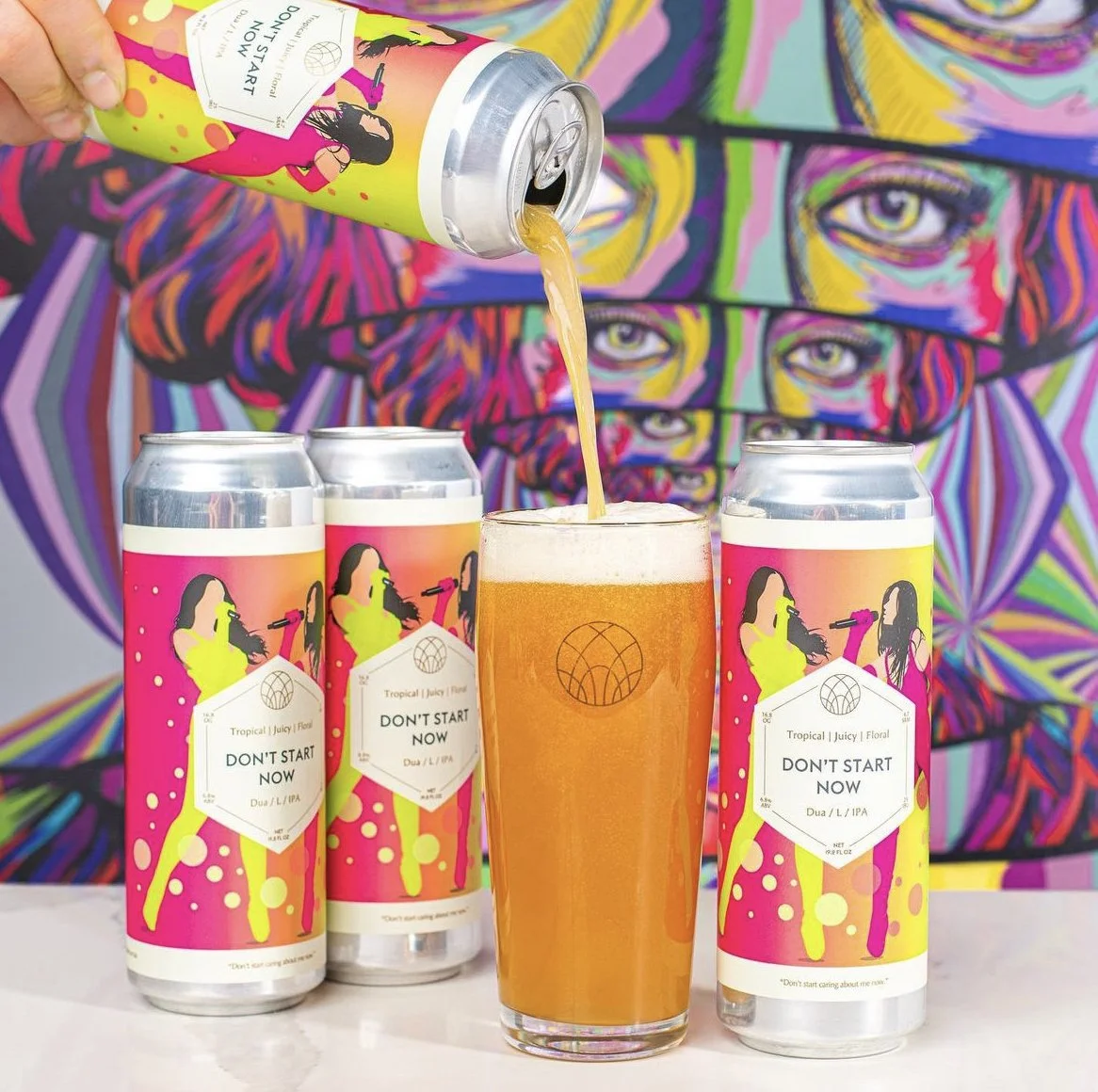
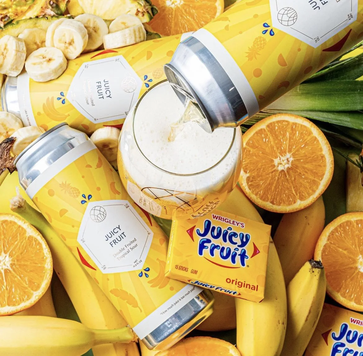
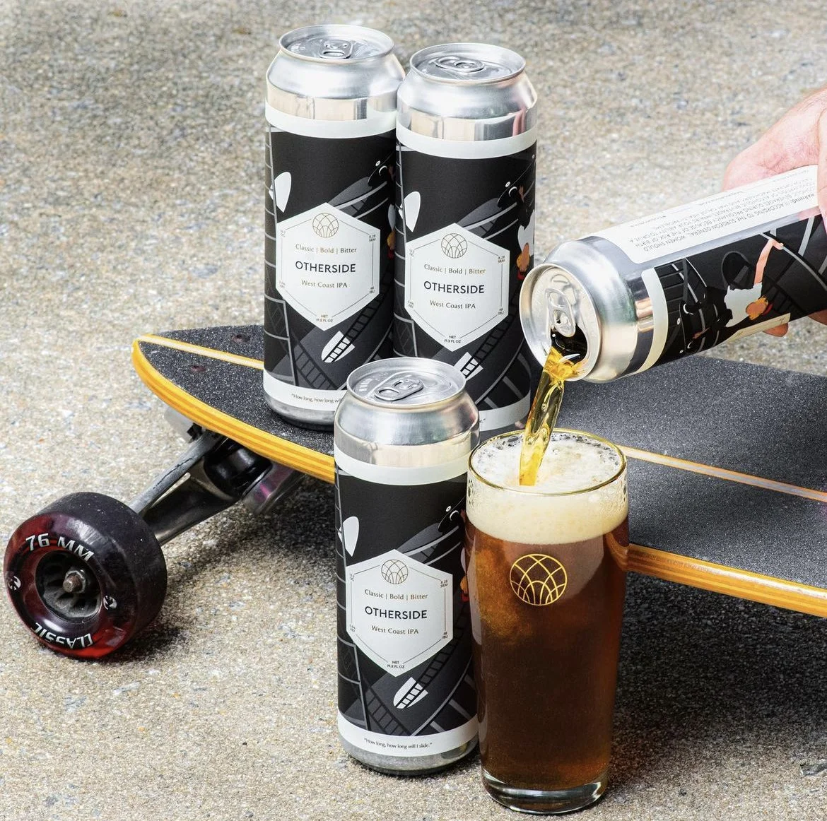
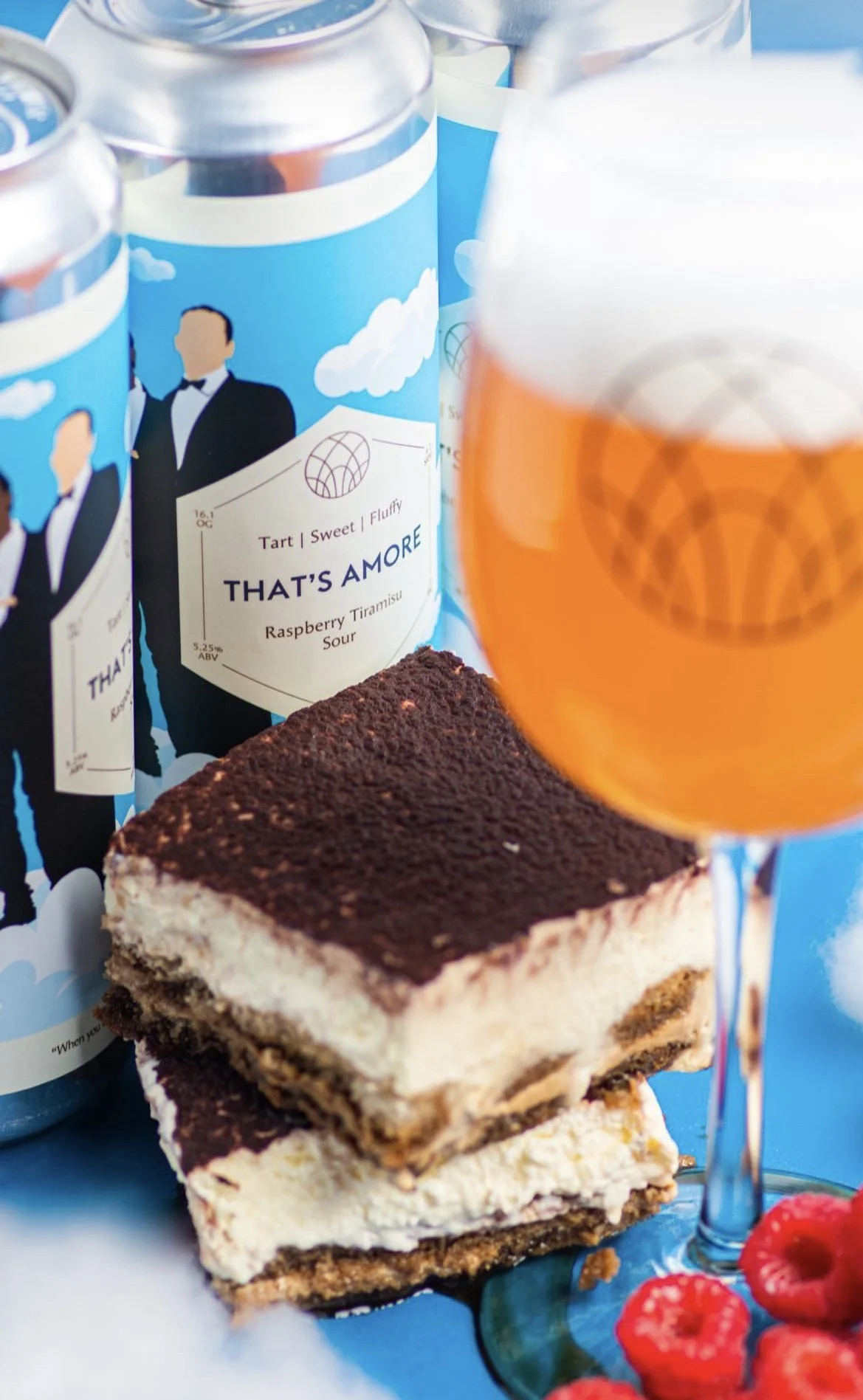
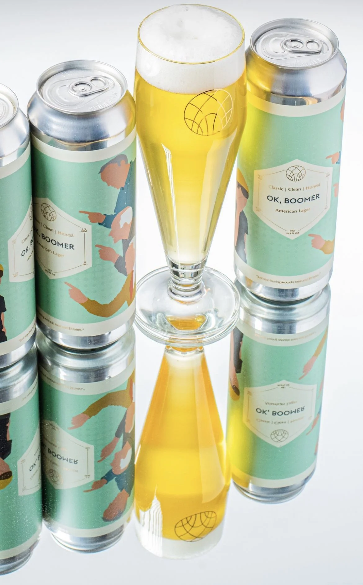
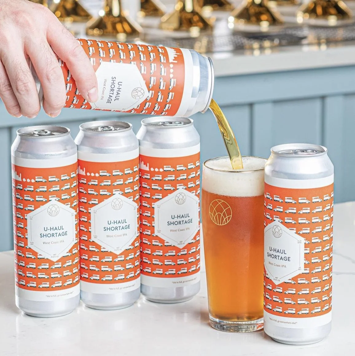
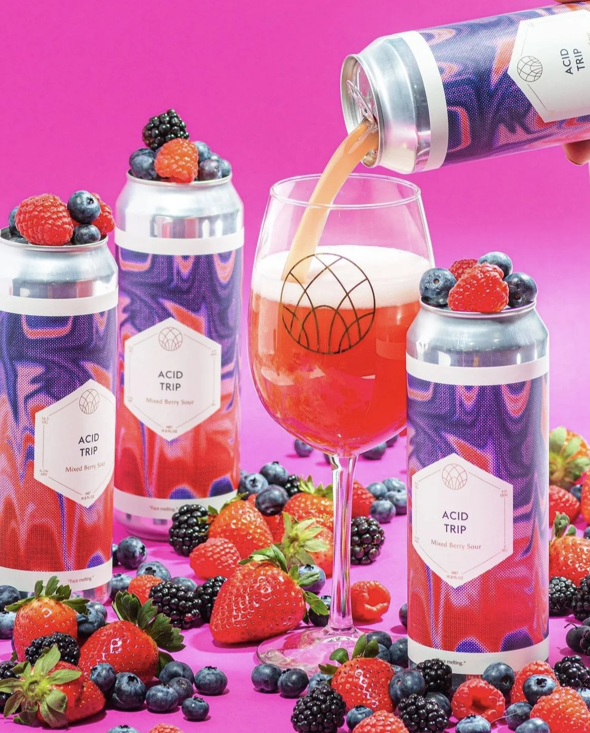
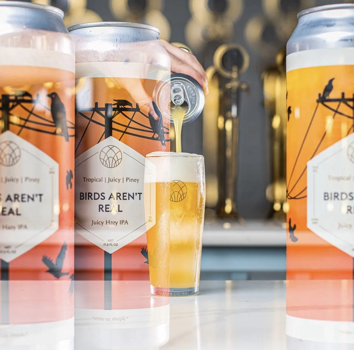
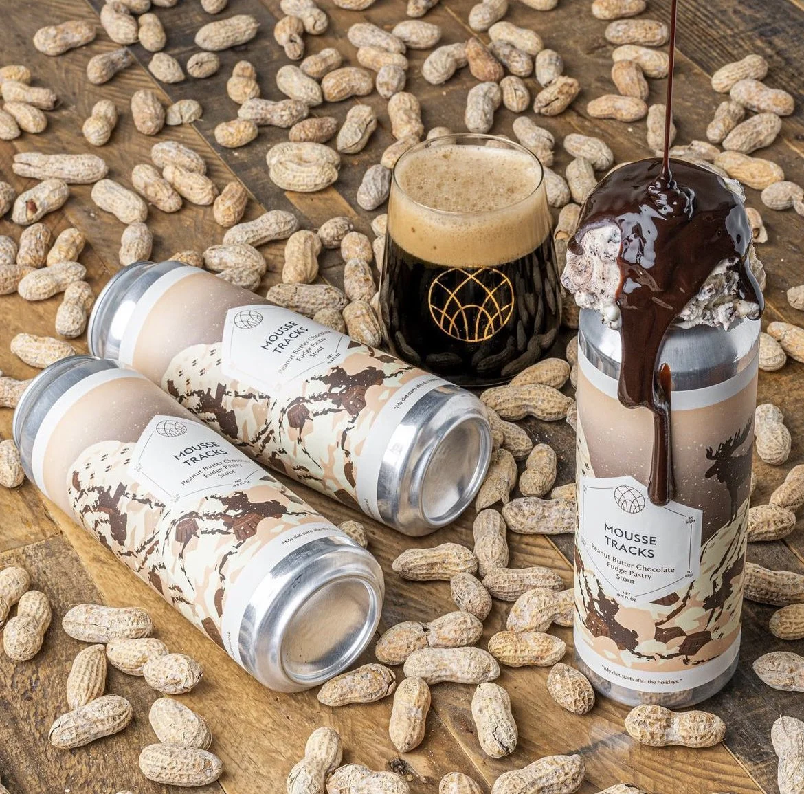
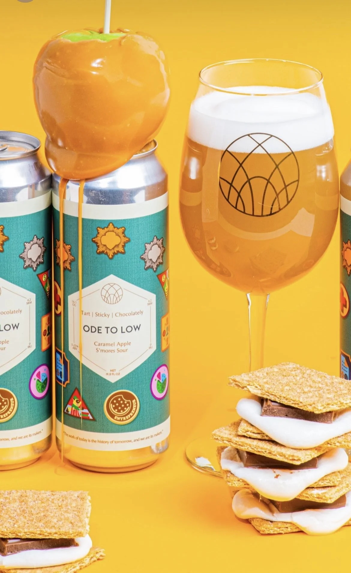
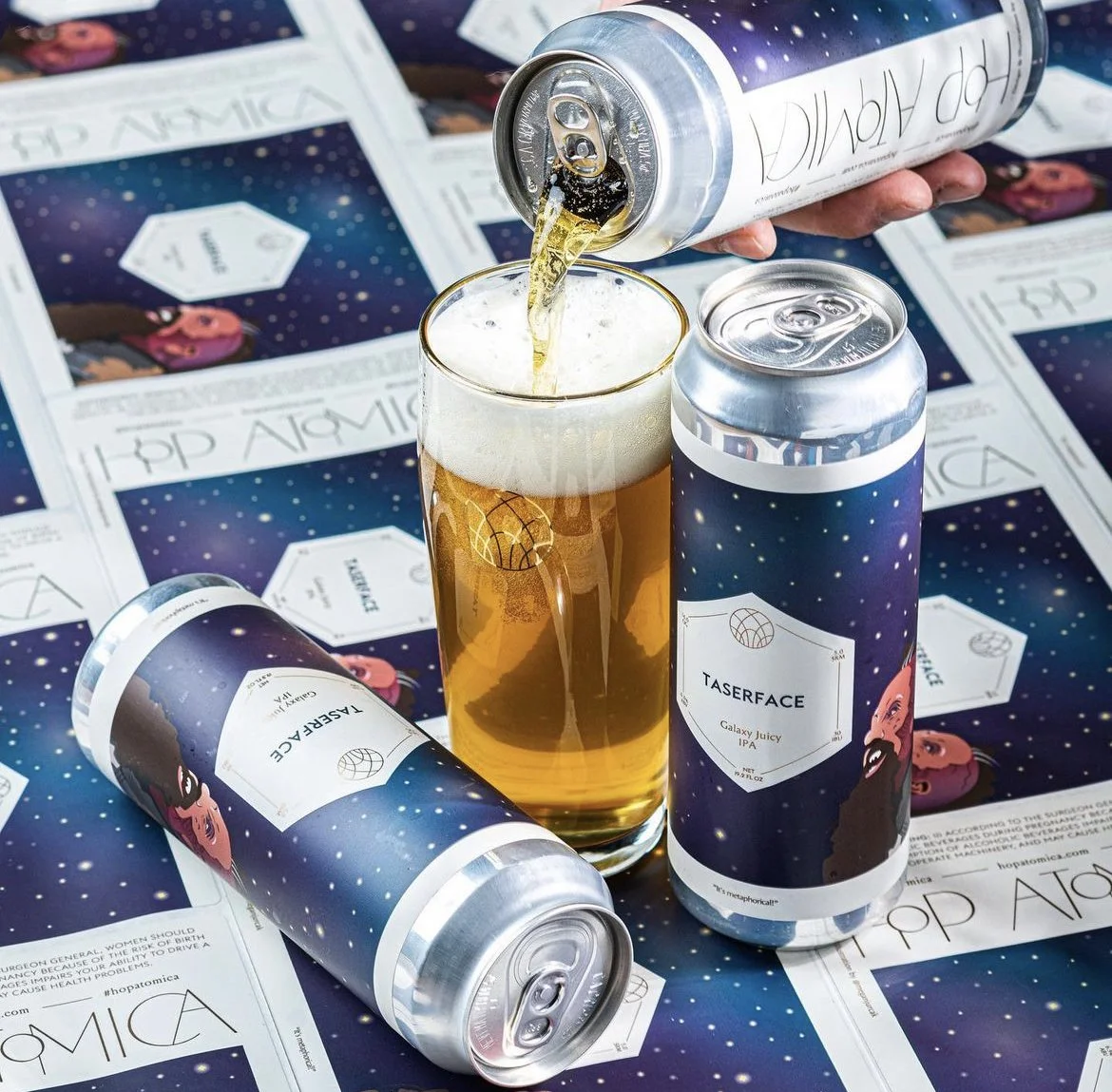
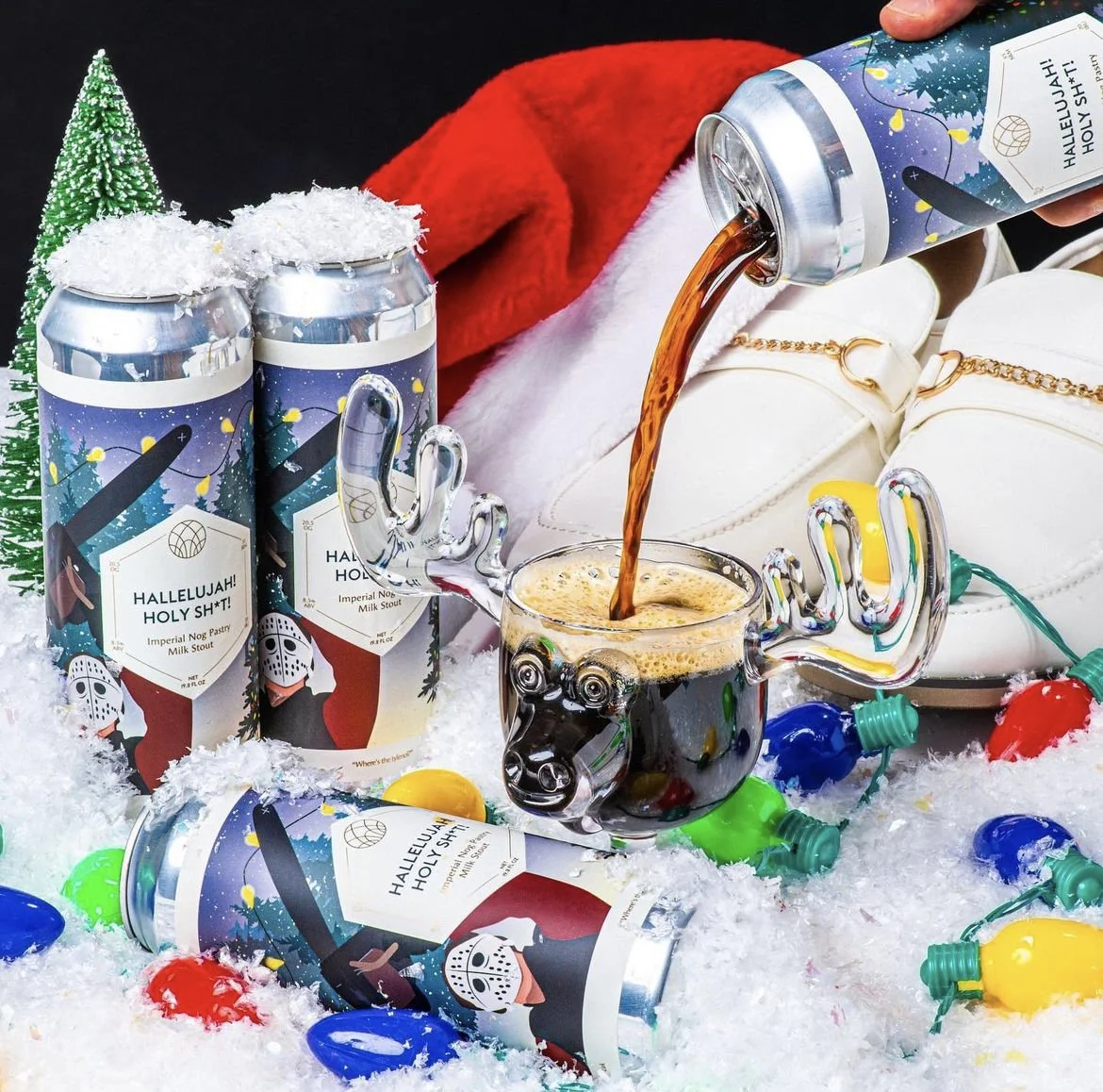
Hop Atomica
Hop Atomica is a local microbrewery located in Savannah, Georgia. For their new batch of brews, they needed fun, expressive designs. They wanted imagery that would complement the creative names of the beers they produced.
A real estate firm based in Charleston requested a logo for their new business. They wanted a design that focused on the name more than the design.
Real Estate Transaction Coordinator, Teresa Poe, needed a logo for her new business. They wanted a design that was fun and creative while also professional.

Martian Sky Industries, LLC is a space robotics company working directly with the government and industry partners to impactfully establish a new and unique commercial market in low-Earth orbit and beyond. They needed a sleek, simple logo that would resonate with their mission.
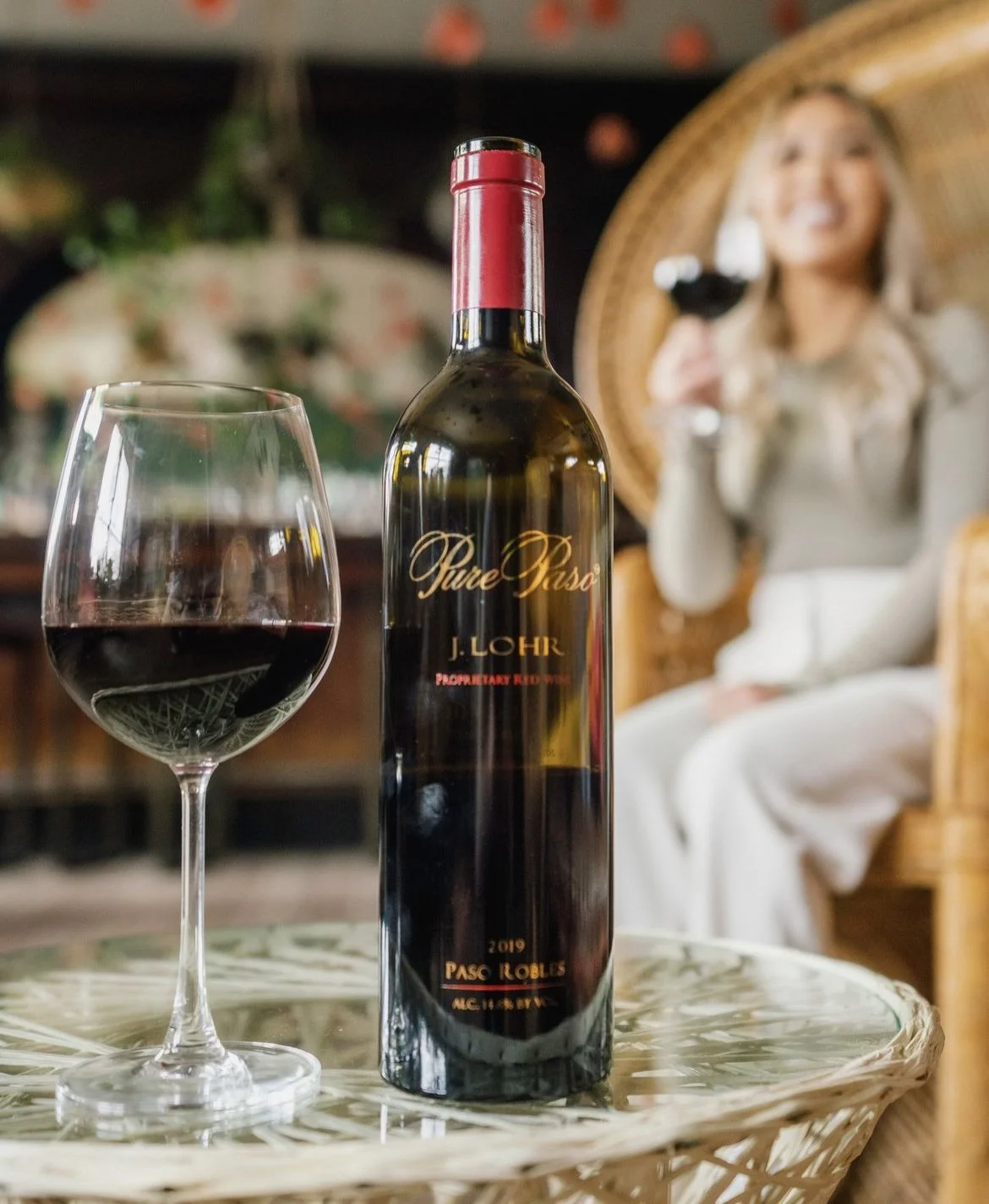
J.Lohr Pure Paso
J. Lohr was releasing a new red wine for its line. They wanted a classic and sleek design. Using a gold and red color scheme, this design paired well with this Savoy wine.
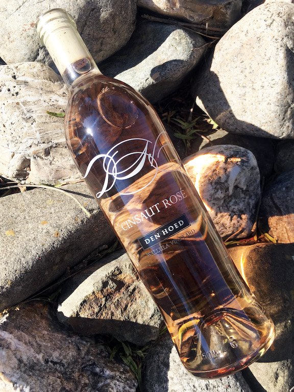
Den Hoed: Cinsaut Rose
This winery needed a redesign for its Rose label because the paper label would come off when it was placed in a bucket of ice. They decided to go with a screen-printed label. The text for the description and government compliance was run up the sides of the bottle so it wouldn't sit behind the logo and disrupt it.


This blog, started by two friends with a passion for food and travel, needed a logo that would illustrate their desire to go around the world trying all different kinds of cuisine.
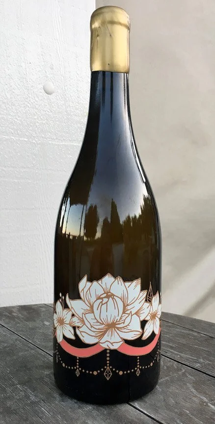
BCA Chardonnay
Backroad Vines needed a design for their new Chardonnay, which was to be used to raise money for Breast Cancer Awareness Month. This design used a lotus, a symbol of rebirth, with a pink ribbon running through it.


Cenote Tequila
A beverage company started in Napa, California. Their first launch was a small batch of infused tequila. They wanted the packaging to be eye-catching while working with the limited space on the small bottles. The design emulated that of a bandana collage using southwest motifs.
